Physical Address
304 North Cardinal St.
Dorchester Center, MA 02124
Physical Address
304 North Cardinal St.
Dorchester Center, MA 02124

Decorating with neutral colors can transform a space into a calm, elegant haven without feeling bland. In this guide you’ll learn practical, design-forward ways to layer tones, texture, and accents so your home feels warm, modern, and personal.

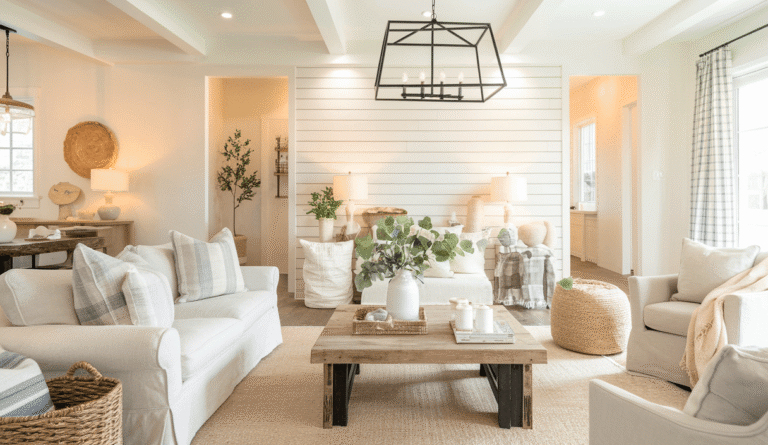
Neutral palettes are flexible, timeless, and perfect for creating a restful atmosphere. Whether you love minimal modern rooms or layered farmhouse comfort, neutral shades act as a canvas for furniture, art, and textiles. Decorating with neutral colors makes it easier to update a room over time—swap a pillow, change a lamp, and the whole mood shifts.
Below are the basic ideas that will keep a neutral space from feeling flat.
Start by testing paint swatches at different times of day. Natural light affects neutrals more than saturated colors. Here’s a simple approach:
:strip_icc()/living-room-starburst-mirror-fireplace-7249300-7f289561697d4caab1c55c152c18da3f.jpg)
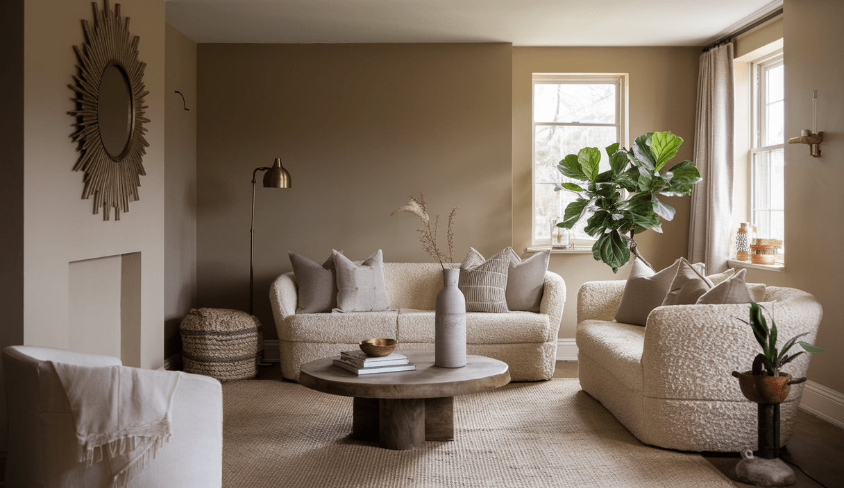
Choose warm neutrals (beiges, warm taupes) to make rooms feel cozy. Choose cool neutrals (stone grays, greiges) for a modern, airy vibe. Many designers combine them carefully—warm wood and brass with cool walls, for example.
When color is restrained, texture becomes the star. Think of texture as the way you show personality without bright hues.

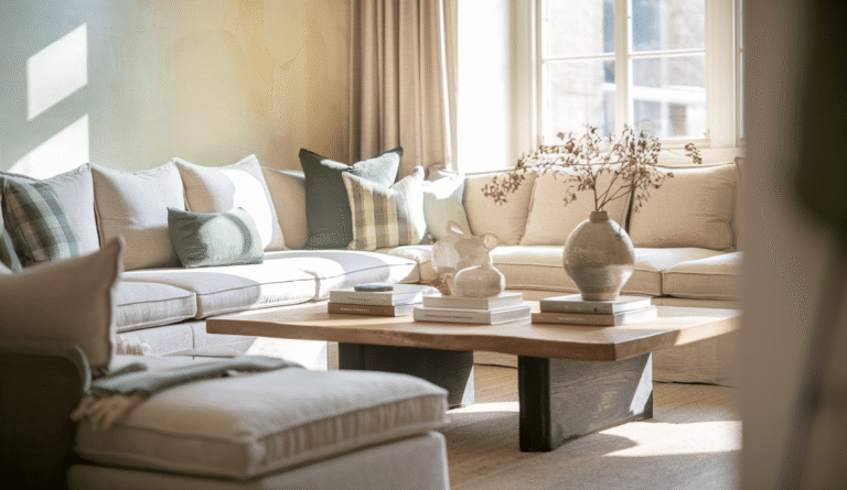
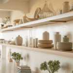
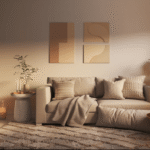
Combine a soft boucle sofa with a jute rug and a brass lamp. Use matte ceramic vases with glossy framed art. These contrasts are why neutral rooms can feel rich and layered.
Every neutral room needs a few visual anchors: a large rug, a statement mirror, or a bold-patterned throw. Small accent colors—mustard, sage, navy, soft pink—can read as neutral in the right context and add subtle personality.
Want ideas? See community conversations where people share how tones like mustard, sage, brown, and navy read as neutral in many homes—great for inspiration: this Reddit thread (May 11, 2024).
Good scale and placement keep neutrals from feeling monotonous:

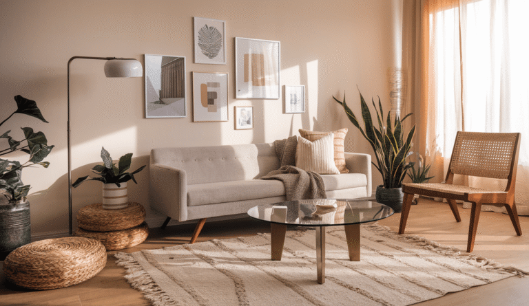
Art and pattern are permission to be bold—without bright color. Black-and-white photography, soft abstract prints, or a gallery wall of frames add personality and context to neutrals. Mirrors enlarge the space and reflect light.
If you want guidelines for using a neutral palette while keeping personality, StoneGable’s practical tips help you pair textures and use architectural elements effectively: 6 Tips for Decorating with Neutrals.
Watch this short video for real-room examples and quick staging tips.
Neutral rooms can go wrong, but these fixes are simple:
Emily Henderson also highlights common neutral-room pitfalls and how to keep neutrals from feeling boring—good reading if you want examples and do/don’t visuals: Design Mistakes: How Not to Design a Boring Neutral Room.
Here are quick room concepts you can adapt.
White walls, pale wood, simple silhouettes. Keep décor minimal but textured: a chunky knit throw, terracotta pot, and a slim black floor lamp.
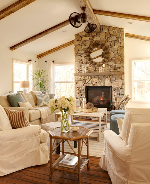
Greige walls, leather sofa, brass hardware, and a patterned wool rug. Add plants and soft linen pillows.
Off-white walls, reclaimed wood table, layered rugs, and vintage ceramics. For inspiration see farmhouse living rooms grouping neutrals with rustic accents: Decorating with Neutral Tones: A Resurging Trend (town-n-country-living.com).
Use this short checklist when building a neutral room:
Many home decorators love sharing small neutral-room wins. For real-life ideas and feedback, you can browse discussions and posts where people show their neutral spaces and how colors like mustard or navy can read as neutral when used sparingly: Facebook group discussion (Jan 12, 2025).
For guidance on making an inviting neutral living room, French Country Cottage covers layering and using softer colors as accents: How to Create an Inviting Living Room with Neutrals.
A little accent color can elevate a neutral scheme. Options that often read neutral include muted mustard, olive sage, navy, and dusty pink. If you want community opinions on pairings, see this Facebook thread where decorators discuss how tan and blue pair at holiday time: Community decorating Q&A (Nov 18, 2024).
For additional tips on pairing neutral tones, textures, and architecture, check these helpful resources: StoneGable’s practical tips on neutral pairings (StoneGable) and community design threads where homeowners share real-room photos and color notes (Reddit conversation).
In short, focus on layering tones, mixing textures, and adding clear anchors so the room reads as intentionally designed. Keep testing swatches and lighting until the palette feels right.
Pick one neutral sofa, a textured rug, two patterned pillows, and a single dark or metallic accent. That small formula will give you a polished, comfortable room in a weekend.
For visual ideas and real before-and-after projects, check curated galleries like Better Homes & Gardens’ neutral living rooms with a twist: BHG neutral ideas.
Decorating with neutral colors is a smart, enduring choice. With attention to undertones, texture, and thoughtful accents, you can create rooms that feel both calm and full of character. Ready to keep designing? Explore more guides and room plans to refine your style—start with the collection of smart, actionable tips on zenpulsehub.com.
Neutrals typically include whites, creams, beiges, taupes, grays, and muted browns. Some muted tones like navy or olive can read as neutral when used sparingly.
Use 2–4 neutral shades: a main wall color, a furniture tone, a trim/ceiling shade, and one accent neutral for depth. Repeat these across materials and textures for cohesion.
Not if you layer texture, vary tones, and include visual anchors like art, mirrors, or a bold dark accent. Texture and contrast are the keys to avoiding a flat look.
Yes, but do it intentionally—use warm woods and brass with cool wall colors, or keep one part of the room consistently warm while the other reads cooler to create balance.